KOLIBREE

UX/UI 

INTRODUCTION

Kolibree, the smart oral care company is dedicated to innovation of connected health solutions, such as the first toothbrush with embedded AI, and the first connected sonic toothbrush with 3-D motion sensors. The company attended the international CES 2015 in Las Vegas and launched a Kick Starter project. They requested my services to design a website to showcase their product and introduce their project to the world. 
www.kolibree.com
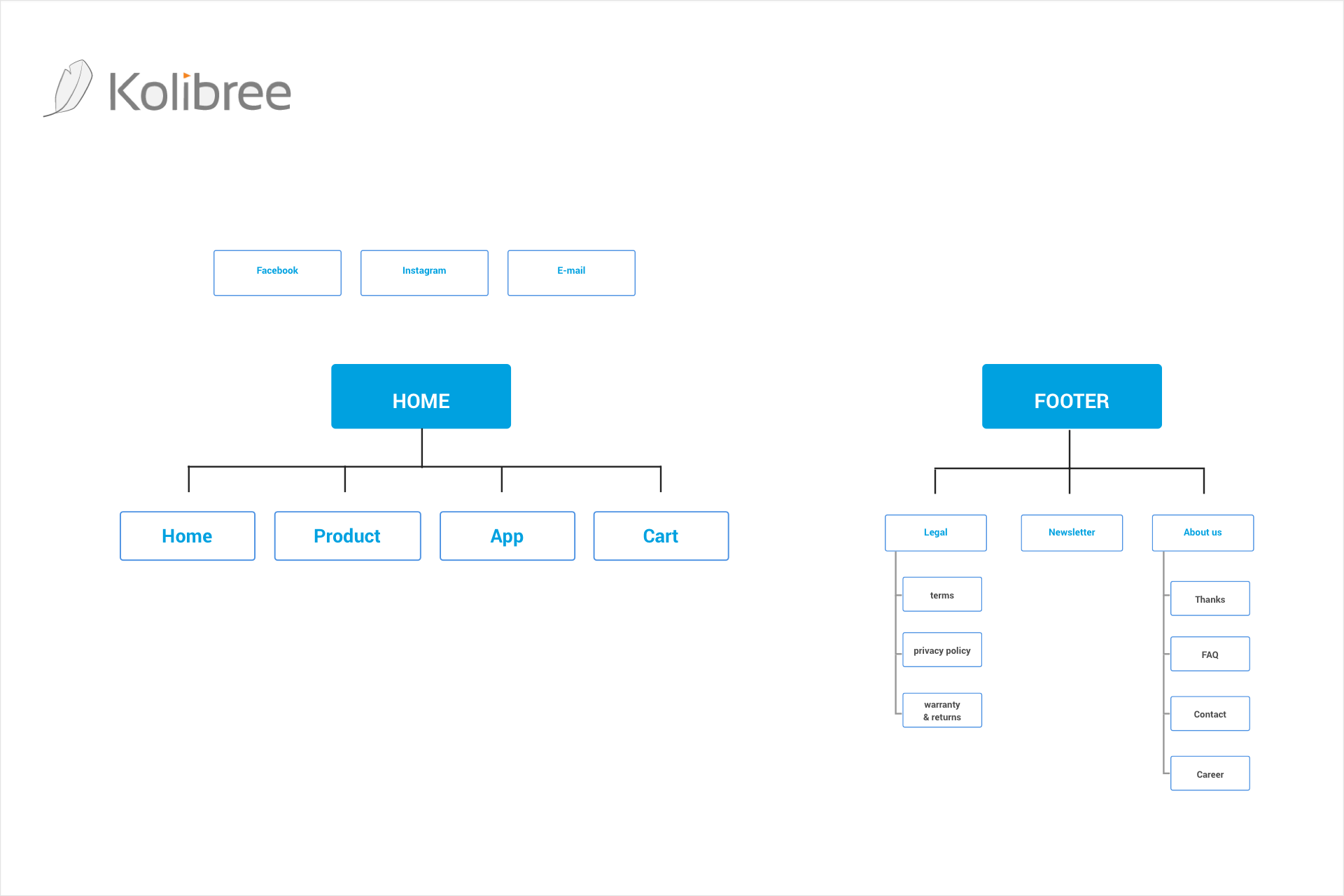
UX: INFORMATION arquitecture
The objective of this website was to present the product in detail and its main functionalities, but the most important was the call to action to pre order. I used the footer to include a list of all the legal aspects in order to gain the trust of the potential consumer. It was a new company, unknown to the public and the need was on reassuringthe users. The website was divided in 4 main parts, the harm, the product, the app and the cart.
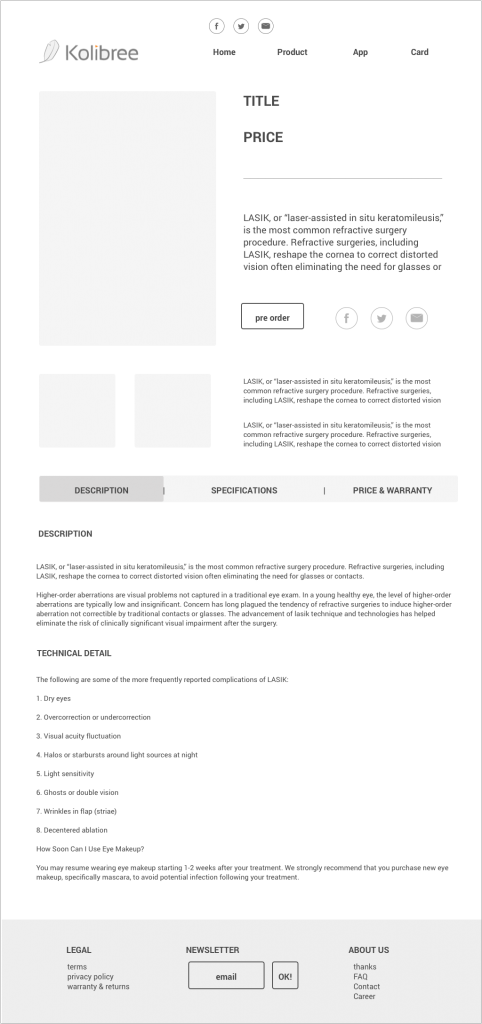
UX: WIREFRAMES
For any new product, communication is essential. The website's main objective is to educate the potential buyer. To attend the need of information we have created a small guide of the product on the home page. There is a backbone where in which each section the benefits of the product are explained.
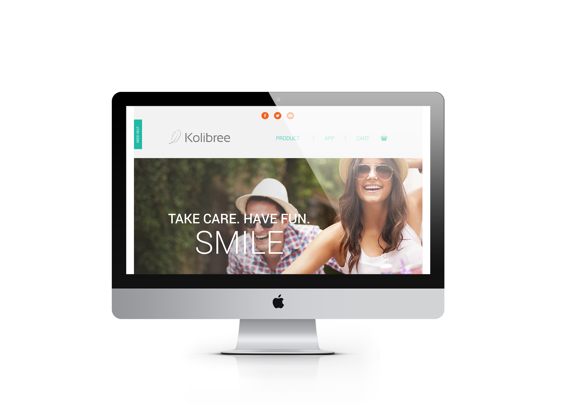
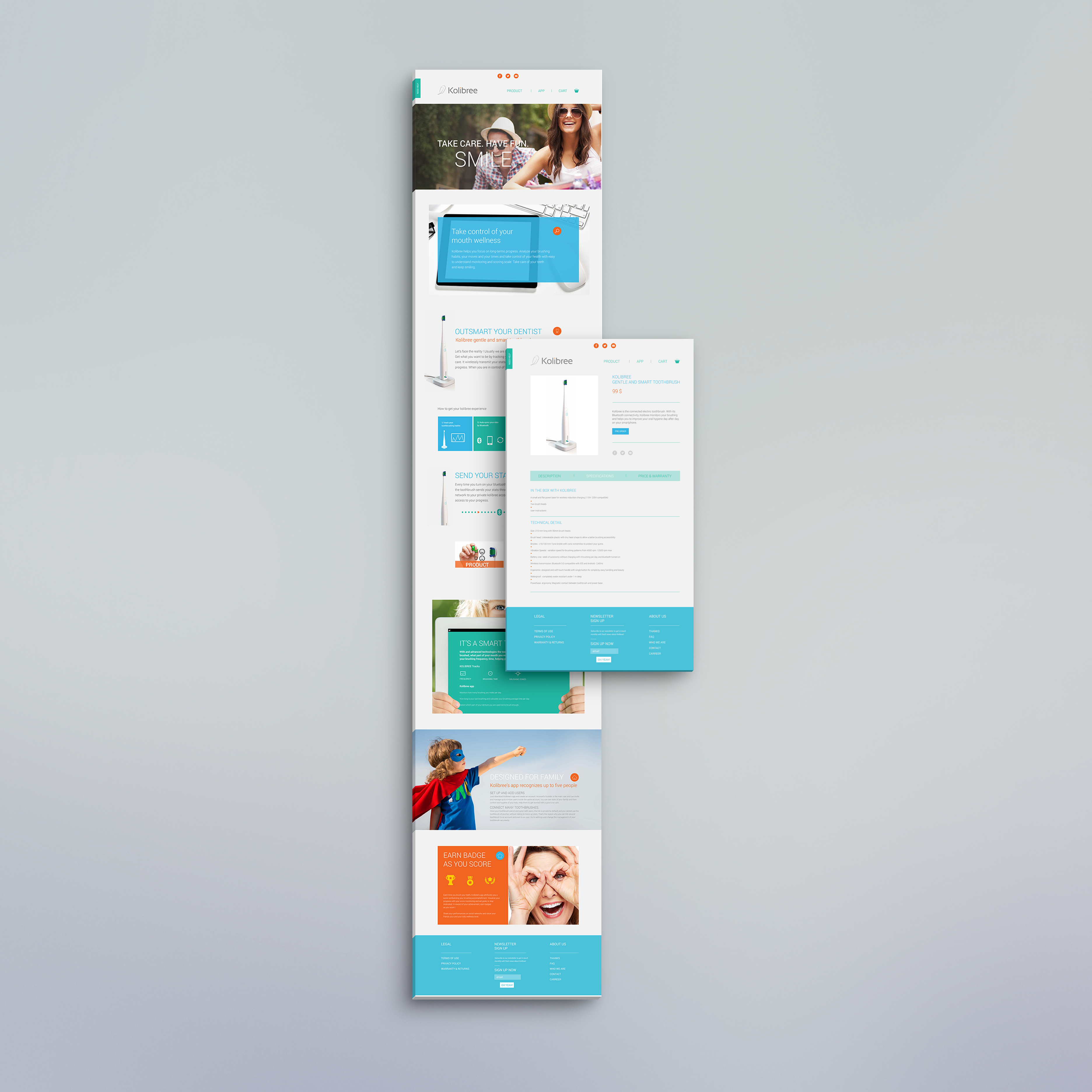
UI: Website design
Cool, cheerful and modern, the design of this website spreads its energy to the visitor. Smiles, cheerful children…the site shares the values of the company and the benefits of the product.