Three Yale graduates came together to found IvySpace after identifying common issues in how students access international education resources. Since then, IvySpace has grown into a diverse global team, working across borders, languages and cultures toward a shared mission of connecting the world through education. There is a magic that happens when a mentor and student sign on from opposite sides of the world - the confidence gained, benchmarks hit and friendships made. The team brings its varied experience to the table so that they can continue to make the world smaller, one class at a time.

IVYSPACE
Brand · UX/UI
INTRODUCTION
Visual Brand Identity
IvySpace gives students around the world direct access to handpicked, elite mentors for private one-on-one guidance.
The brand had to represent this elite IVY league and inspire trust.
Background



The logo can be reproduced on 3 recommended background colours. Colourful background or transparent layers that allow the logo to be clearly visible, identifiable and understandable.
Usage
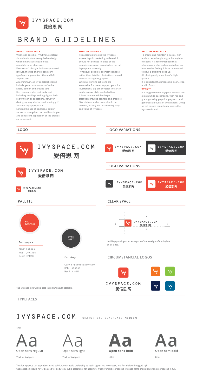
This tool helped to guide and strengthen the body of visual communications.
The information discussed in this manual provides a solid foundation for the IVY Space brand while allowing the artistic and creative flexibility needed to create qualitative and visually stunning communication materials.
Typography
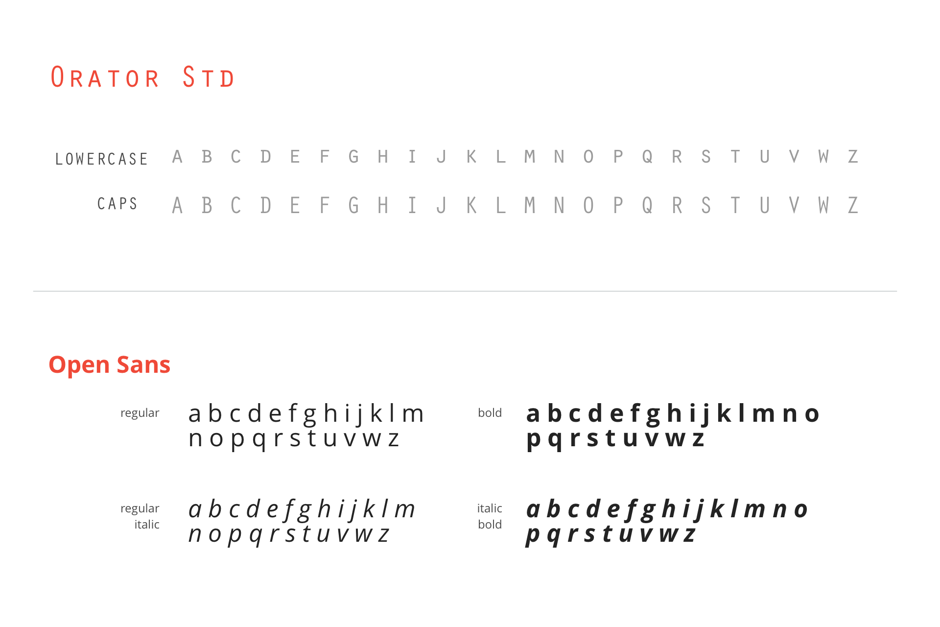
From body copy to headlines, from print to web, this typeface cover all design needs. It is a sans serif developed to work well for both print and screen usage.
Color Palette
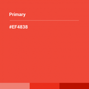
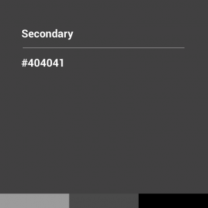
The colour used is a strong and a communicative element of this brand identity. This harmonious blend of colours provides the design a great accessibility while producing a great colour scheme for all communications. This colour palette used together produce a strong brand unity and enhance visually materials that reflect the brand name.
UX: INFORMATION ARQUITECTURE
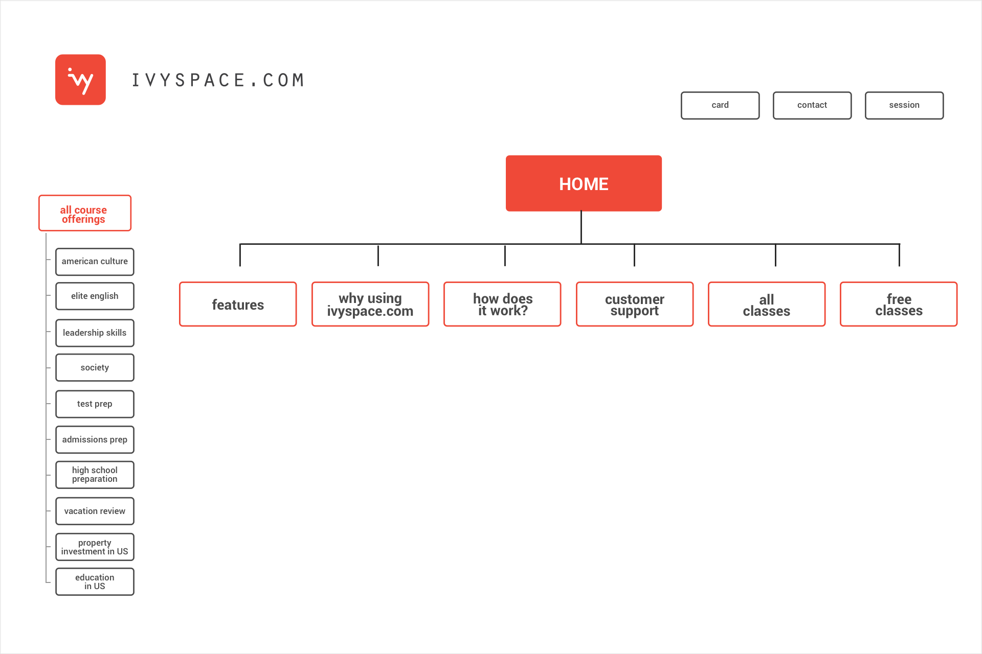
The main questions to be asked when building the information architecture are the following:
Which flow is following the user through the website?
· How the website help to organize the information?
· How it should be presented to the user?
· How the information will help the user and will drive decisions?
In order to answer these questions, I had to define the target audience, the technology used for the website and the important data that needed to be presented.
UX: WIREFRAME
The wireframe is a visual map where the skeletal framework of the website is represented
When creating the wireframe the focus needs to be on:
· The range of available functions
· The different priorities of information and functions
· Rules when displaying a certain kind of information
· The visual effect of the various scenarios on the display
When creating the wireframe the focus needs to be on:
· The range of available functions
· The different priorities of information and functions
· Rules when displaying a certain kind of information
· The visual effect of the various scenarios on the display
UI: website design
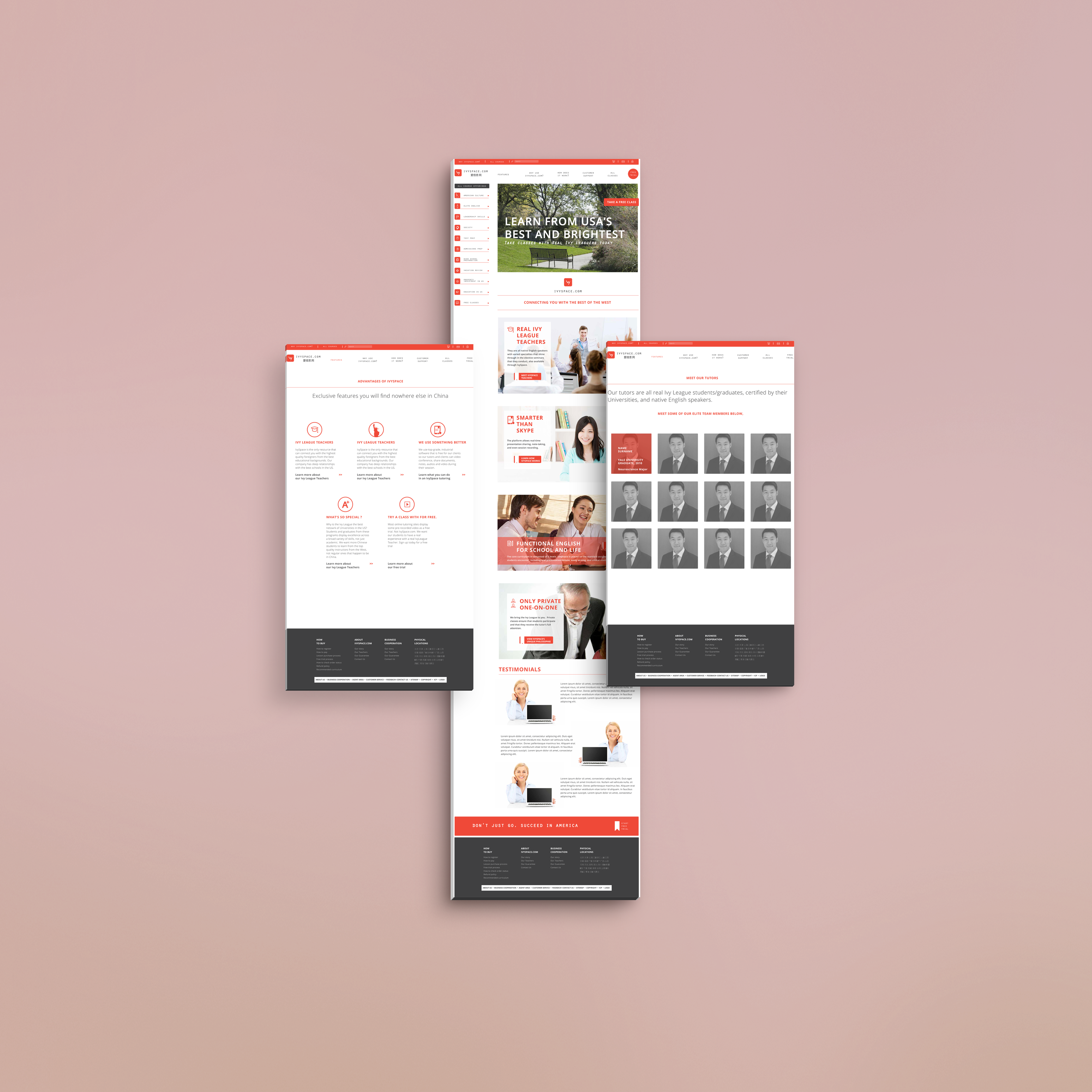
At this stage the visual are no longer in drafting or experimenting mode but almost final.
Just a fine-tuning can be needed. The wireframing is fixed and just a few more tweaks can be made visually at this stage.
Interface ICON
Icons are the visual representation of the brand. Simple, bold and friendly, the core idea and values are shared through them. Each icon is unique and visually distinct, but they are all unified under the main brand concept and their use.


