Romero Polo is a group involved in the development of the infrastructure sector, being one of the basic pillars of the economic and social progress of Spain; and services, contributing to the wellbeing of the citizens. Romero Polo is 140 full time professionals, together with groups of companies in which they have participation the total number of employees reaches 380 people. 2014 turnover was 53.2 million euros, 12% more than in the previous year, 53% of the turnover comes from infrastructure: roads and hydraulic works.
Romero Polo
Brand Identity and Website
INTRODUCTION
Visual Brand Identity

I wanted to reflect the perception customers have about the brand. To share a positive and strong image. An emotional perception of well developed projects that last forever, or at least for a long period of time.
Commitment and professionalism in the development of civil works, infrastructures, urban and environmental services and energy.
Professional and human quality · Commitment to customers · Environmental sustainability · Continuous improvement · Value creation ·
Commitment and professionalism in the development of civil works, infrastructures, urban and environmental services and energy.
Professional and human quality · Commitment to customers · Environmental sustainability · Continuous improvement · Value creation ·
Background

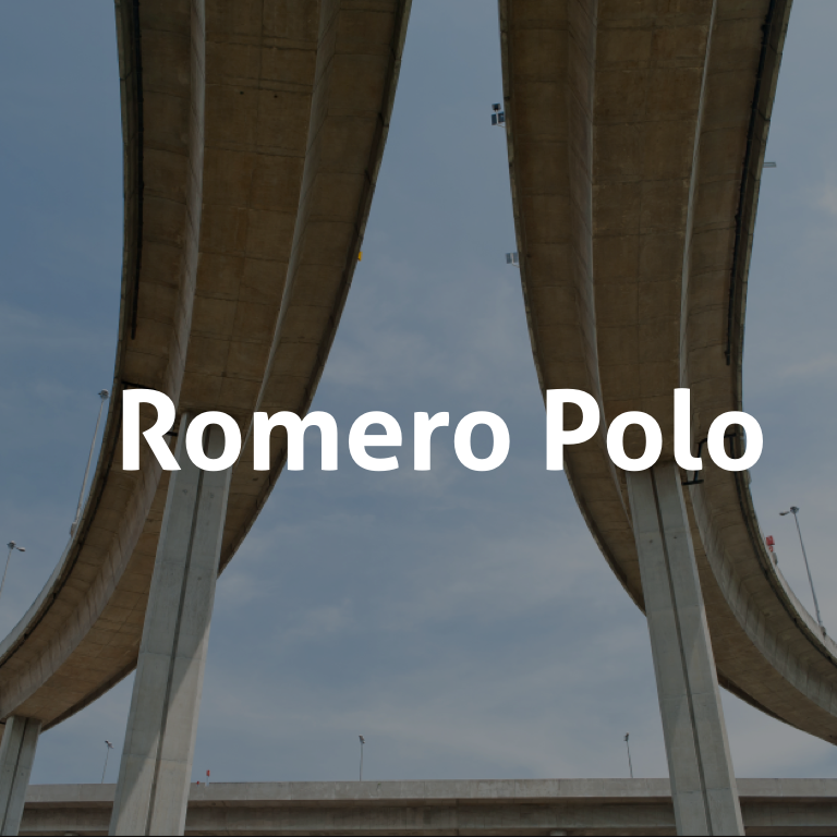
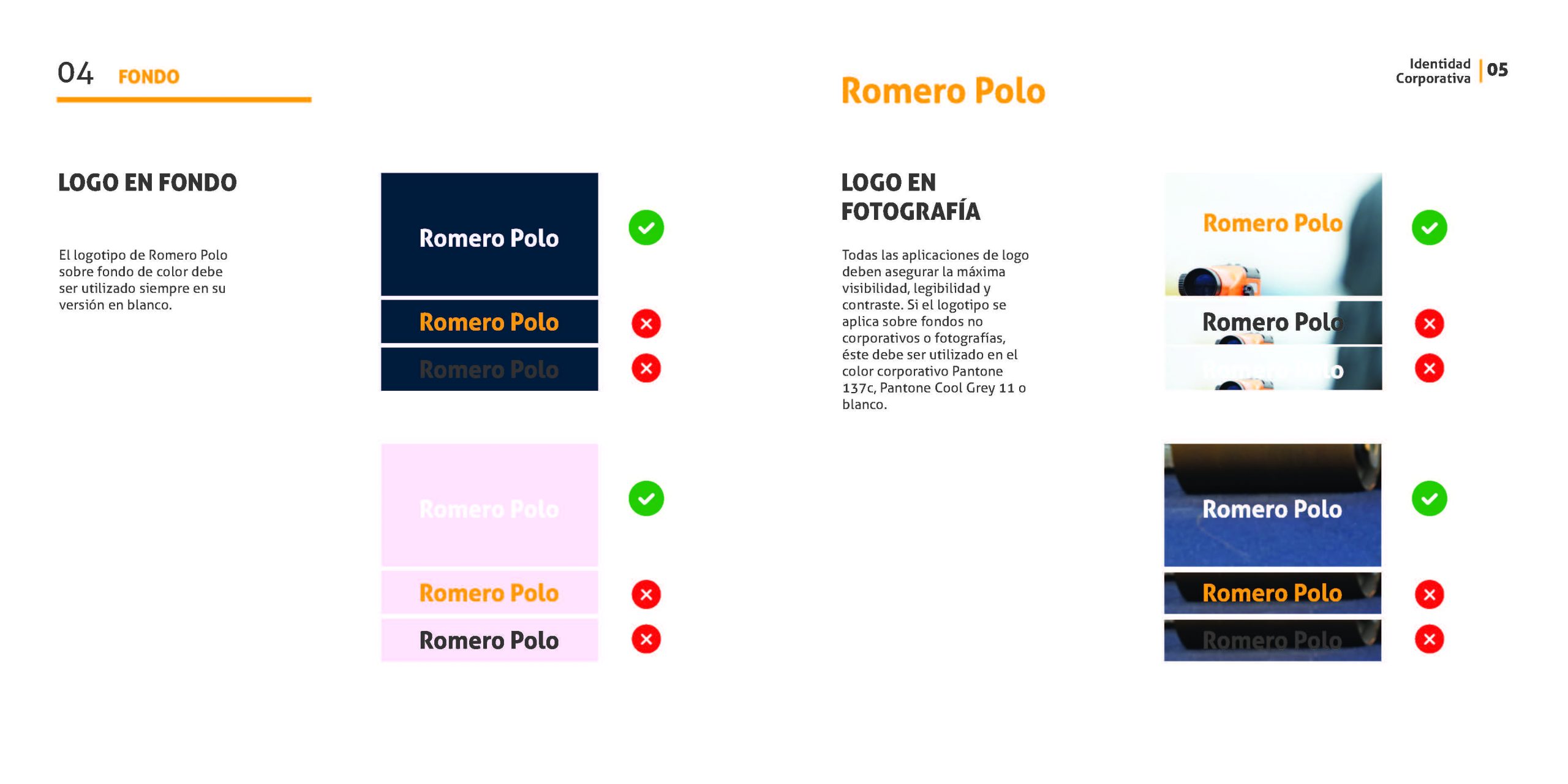
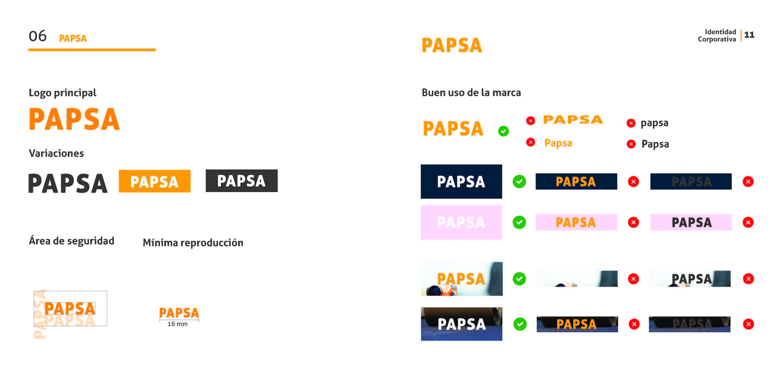
The Romero Polo logo on a color background should always be used on its
white version. All logo applications must ensure maximum visibility, readability and contrast.
If the logo is applied on non-corporate backgrounds or pictures, it must be using the Pantone corporate colors 137c, Pantone Cool Gray 11 or white.
Typography
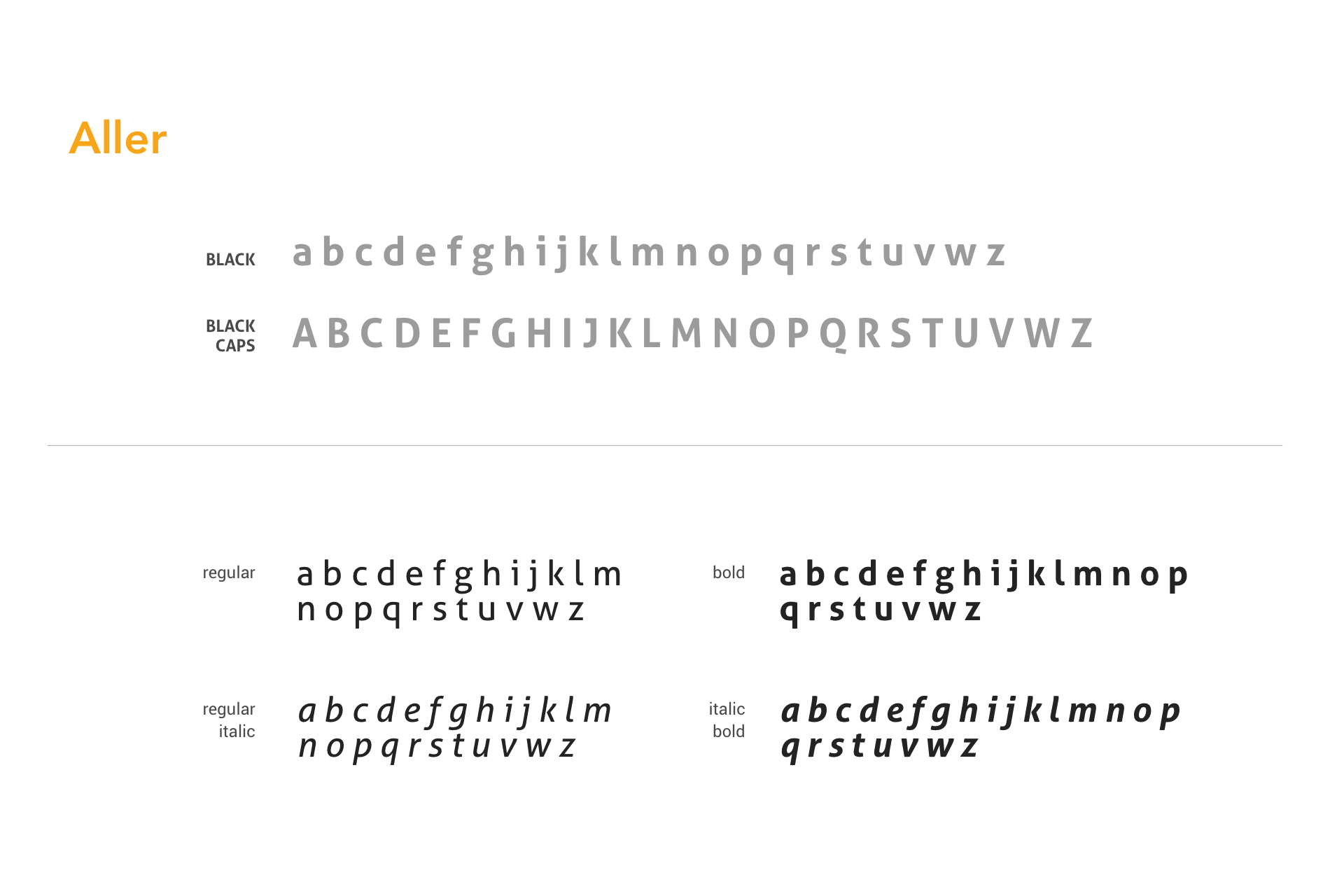
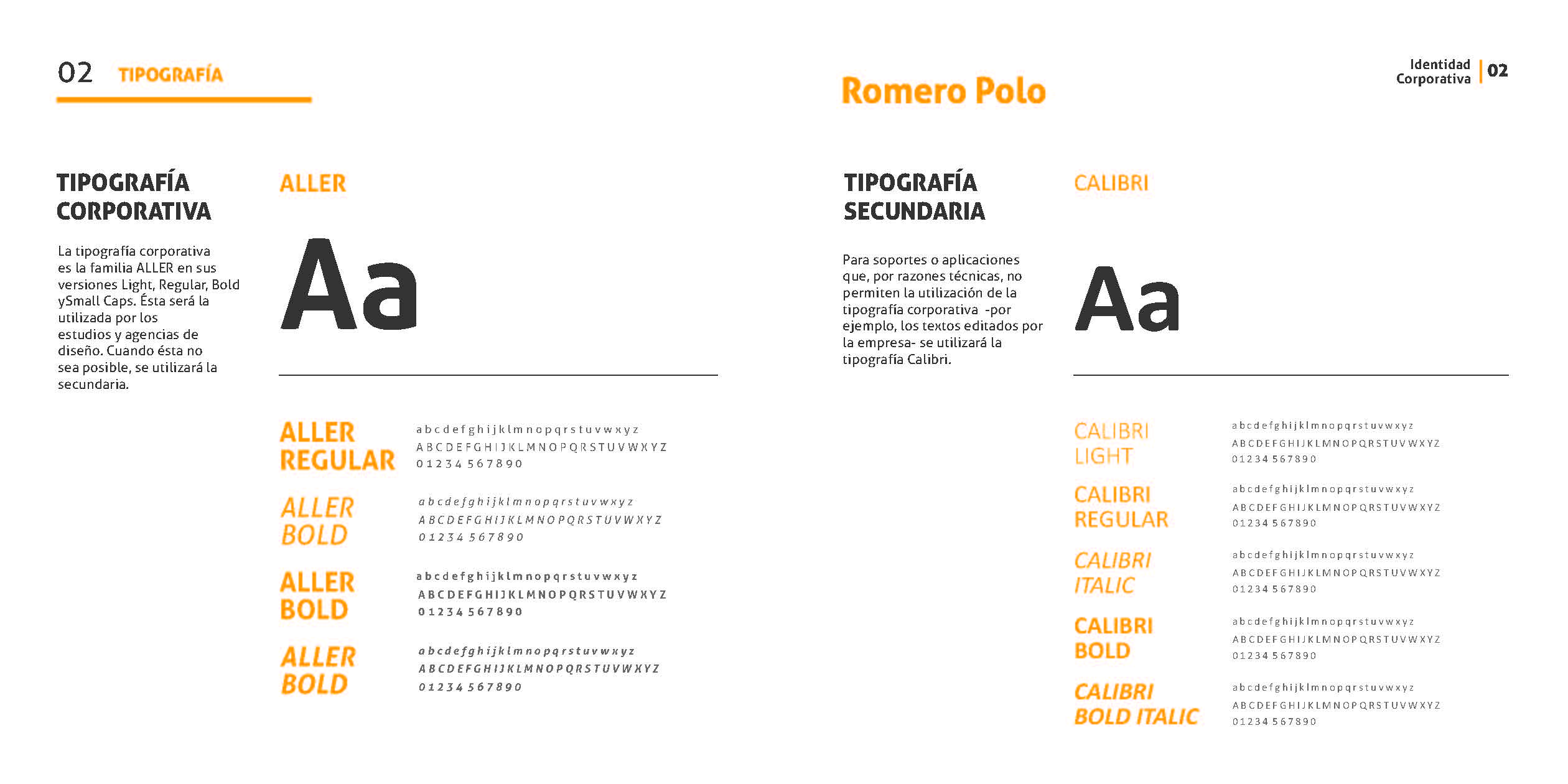
The corporate typography is from the ALLER family in Light, Bold and Small Caps versions.
This has to be the first choice used by design agencies.
In the case it is not possible for any reason, a replacement will need to be used.
Color Palette
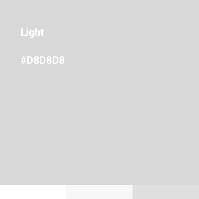


The Romero Polo colour references are the following Pantones: 137c and Cool Grey 11. If the printing condition does not allow Pantone use, it is possible to print in four-colours or in black. The Pantone 137c is the principal colour of the brand and must predominate. Colour variations of Romero Polo are part of the corporate identity and can be used as secondary colours. Consistent use of colours builds familiarity. It was important to lead customers to be able to mentally "link" the logo for the company.
USAGE
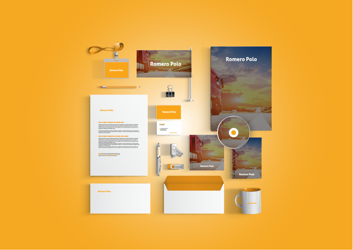
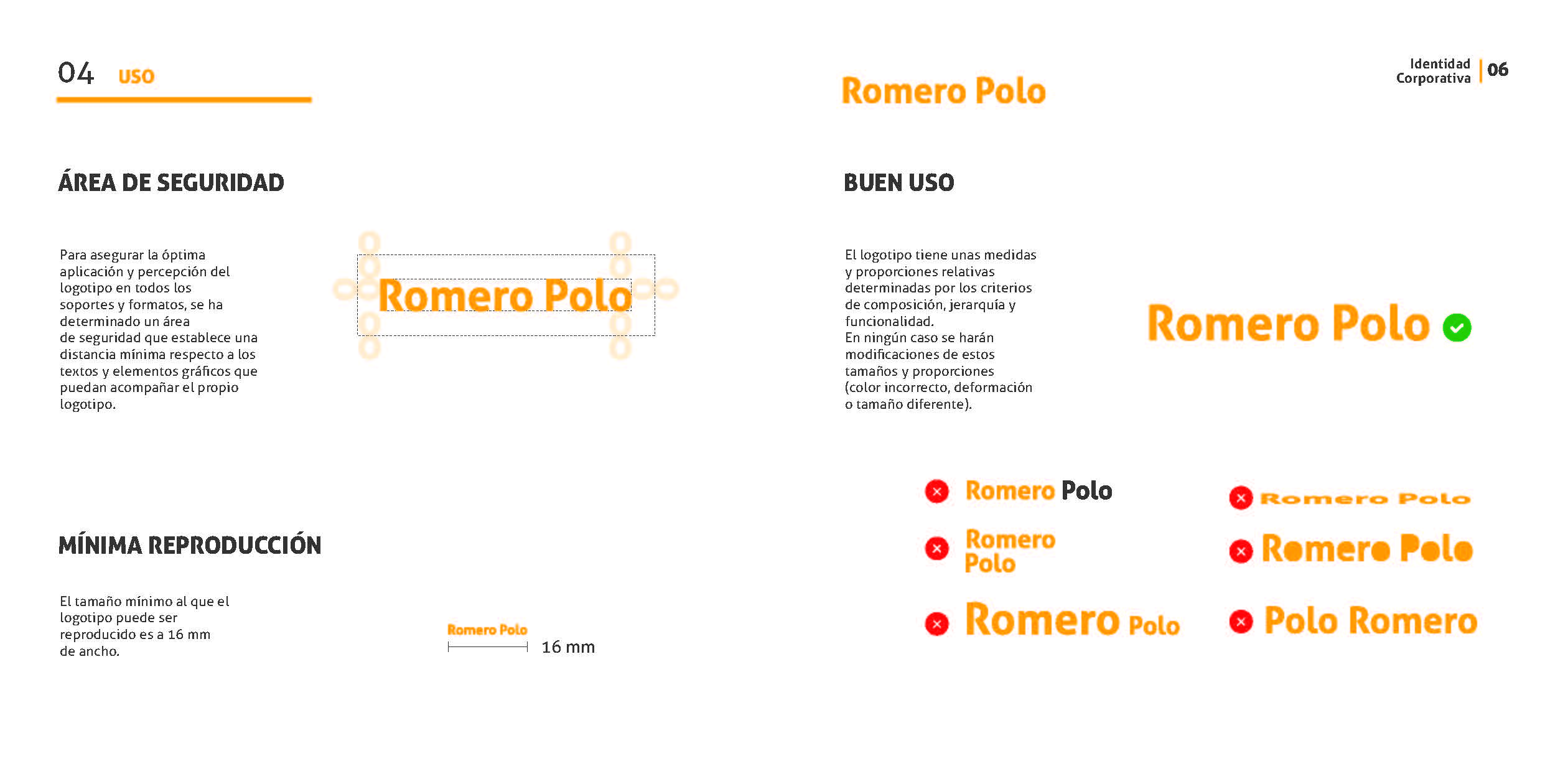
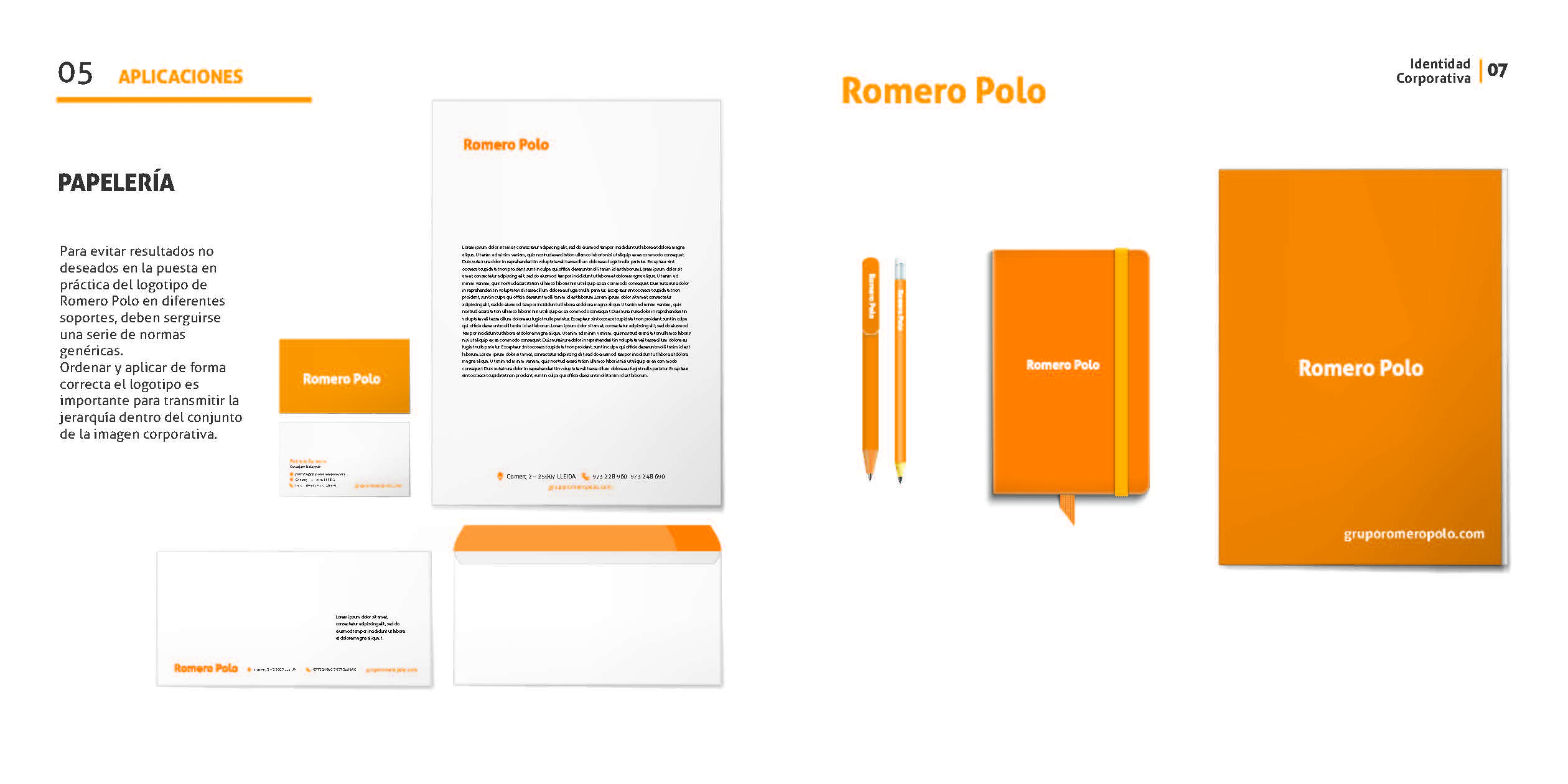
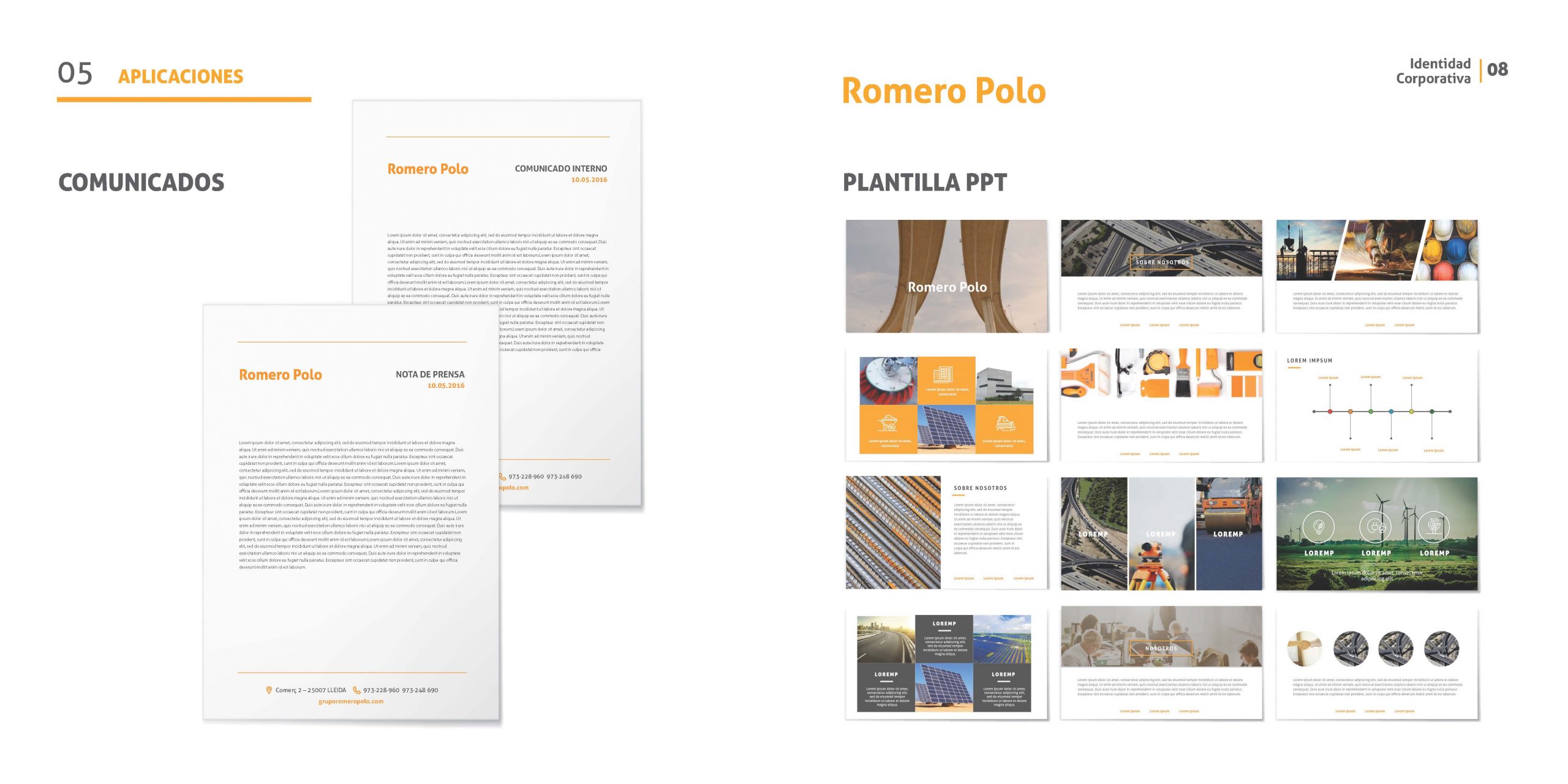
To avoid unintended results in the implementation of the Romero Polo logo on different media, certain standards should be followed.
The logo needs to be arranged and applied in the best possible way in order to share the hierarchy within the corporation. The brand guideline had to be designed with a focus on the product surface look and function.
BRAND GUIDELINES
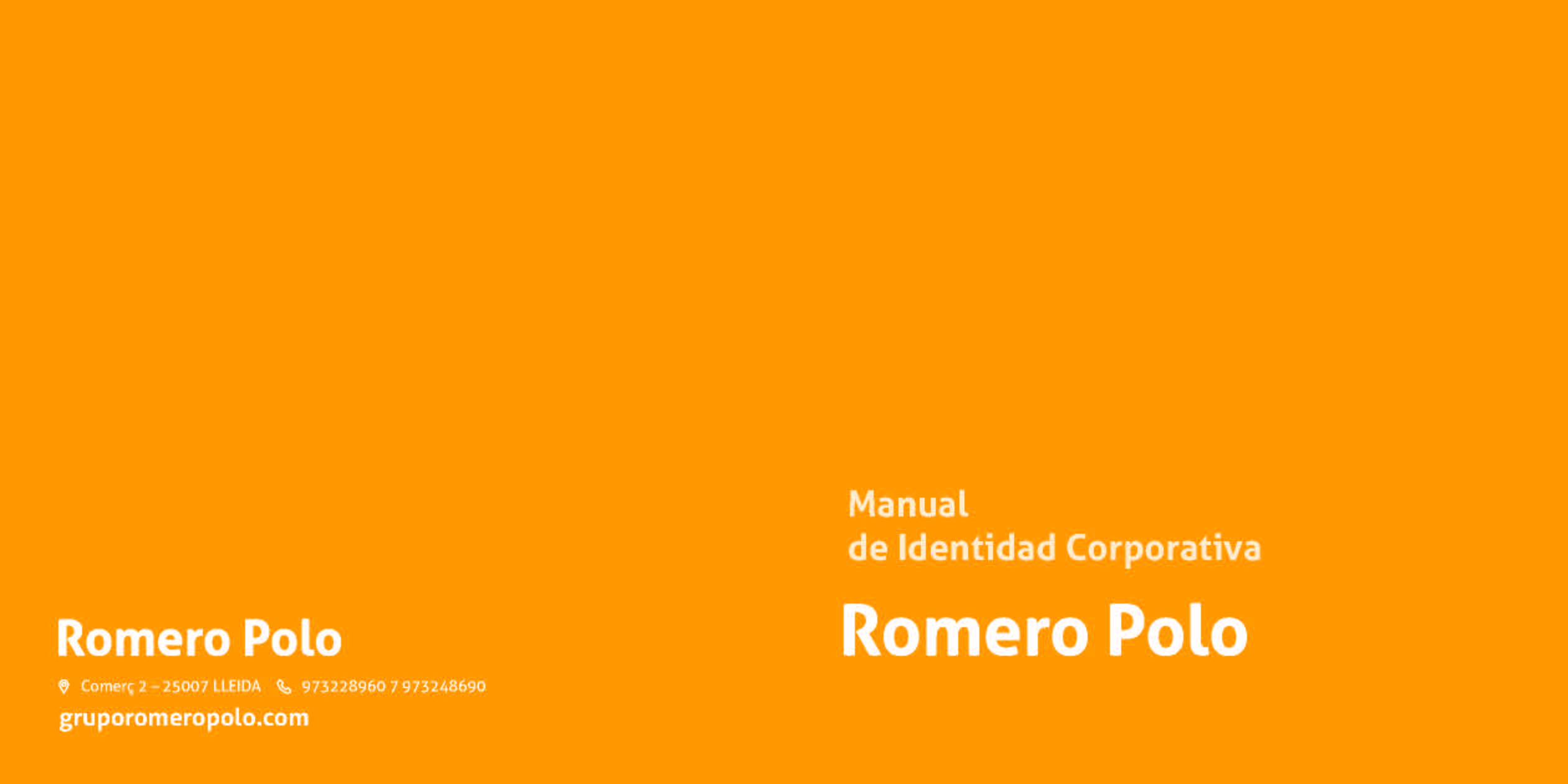
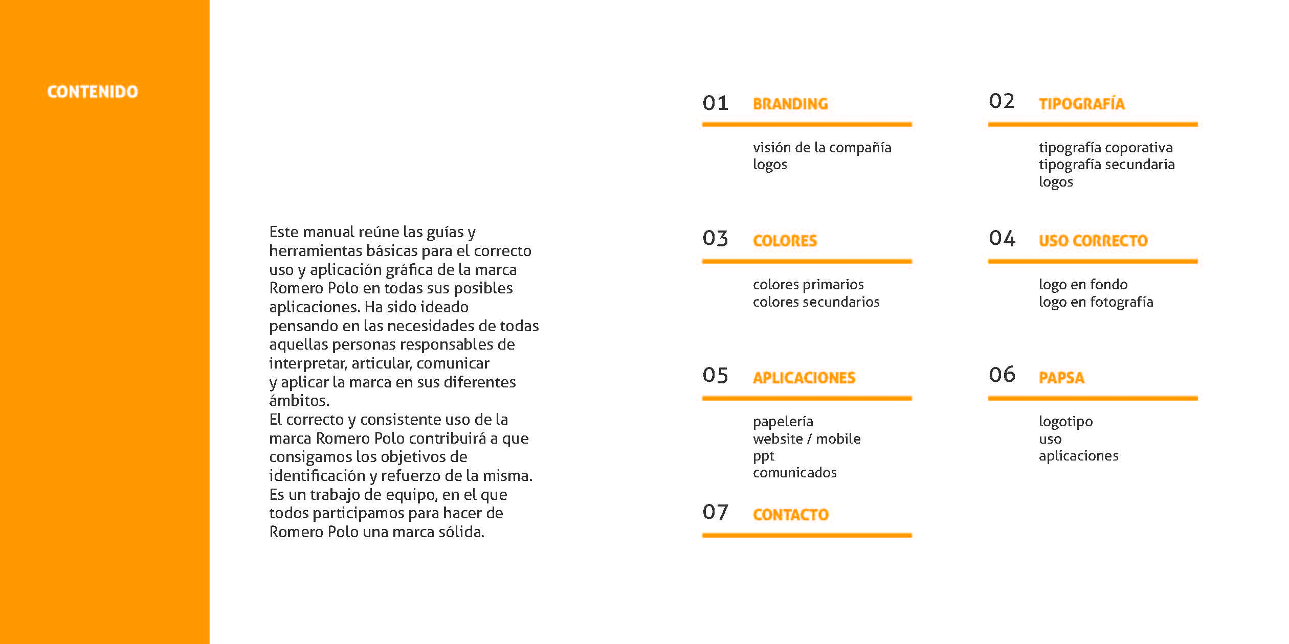
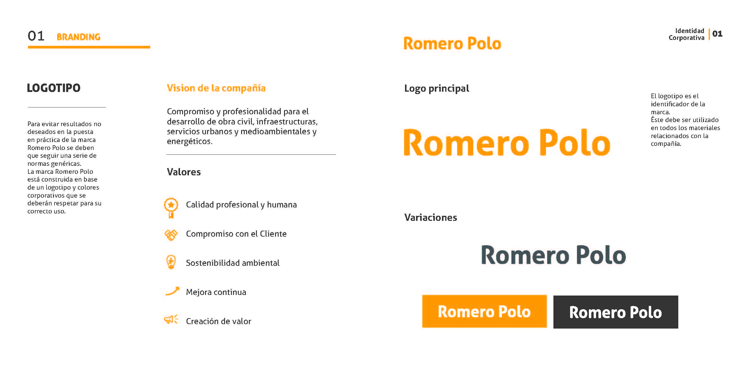

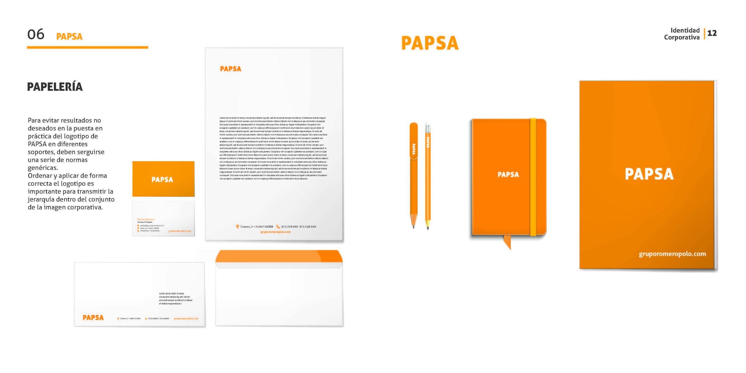
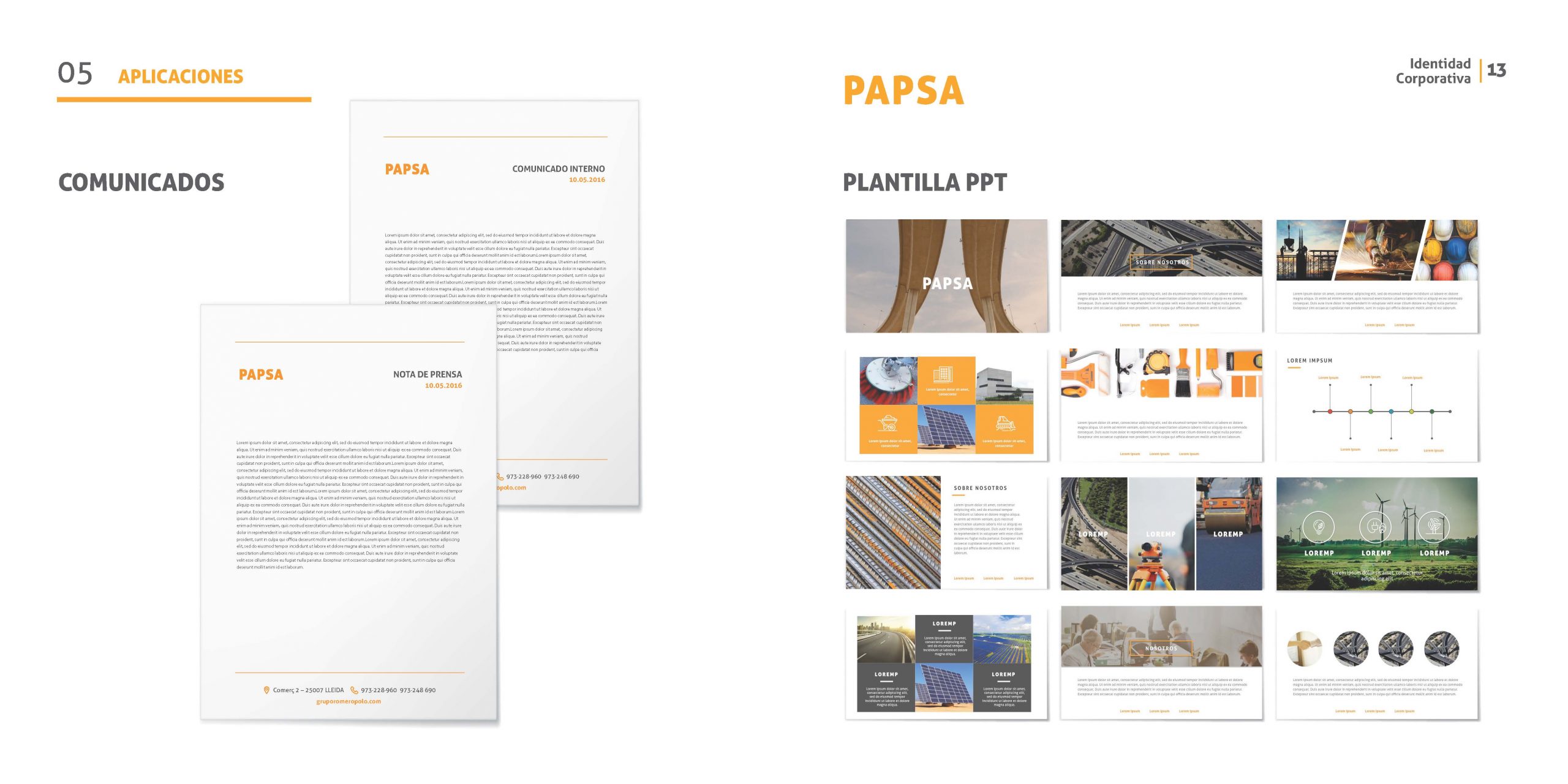
This manual gathers the basic guides and tools for the correct use and graphic application of the Romero Polo brand with all its possible applications. It has been conceived thinking about the needs of all the peoples in charge of interpreting, articulating, communicating and applying the brand in its different support. The correct and consistent use of the Romero Polo brand will help the company to achieve the objectives of identification and reinforcement of its. It is a team effort to make Romero Polo a solid brand.
UX: INFORMATION ARQUITECTURE
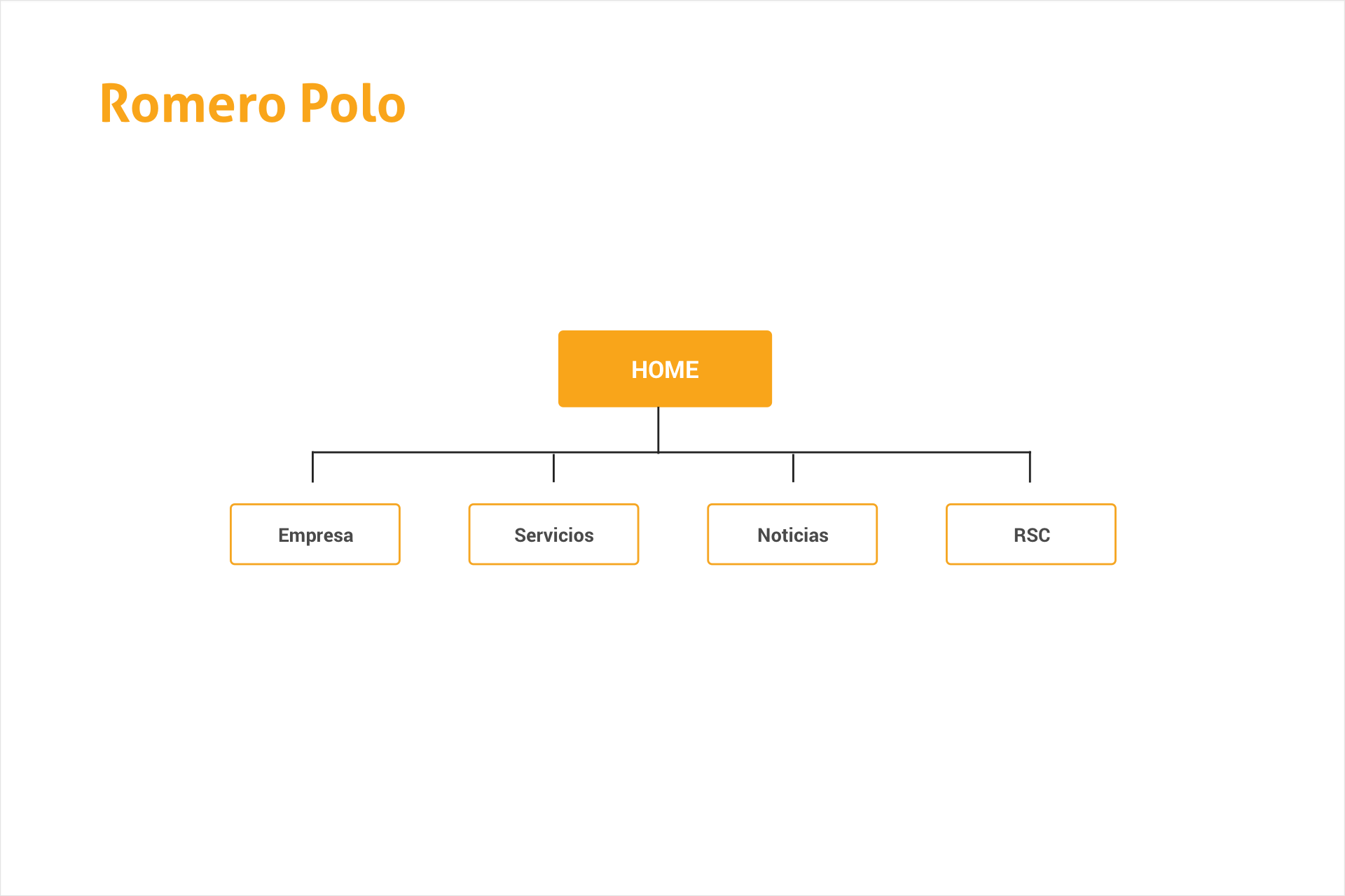
The information architecture determines how the information across the website is displayed. In order to build this hierarchy, I had to think about what the user was expected to see and what content Romero Polo wanted to connect with the user. I wanted to prevent information architects from inadvertent overloading the user with too much information all at once. The decision to have the content well-organized and well structured makes the website easier to read, understand and more useful to the visitor. The user architecture is a crucial for a successful user experience.
UX: WIREFRAMES

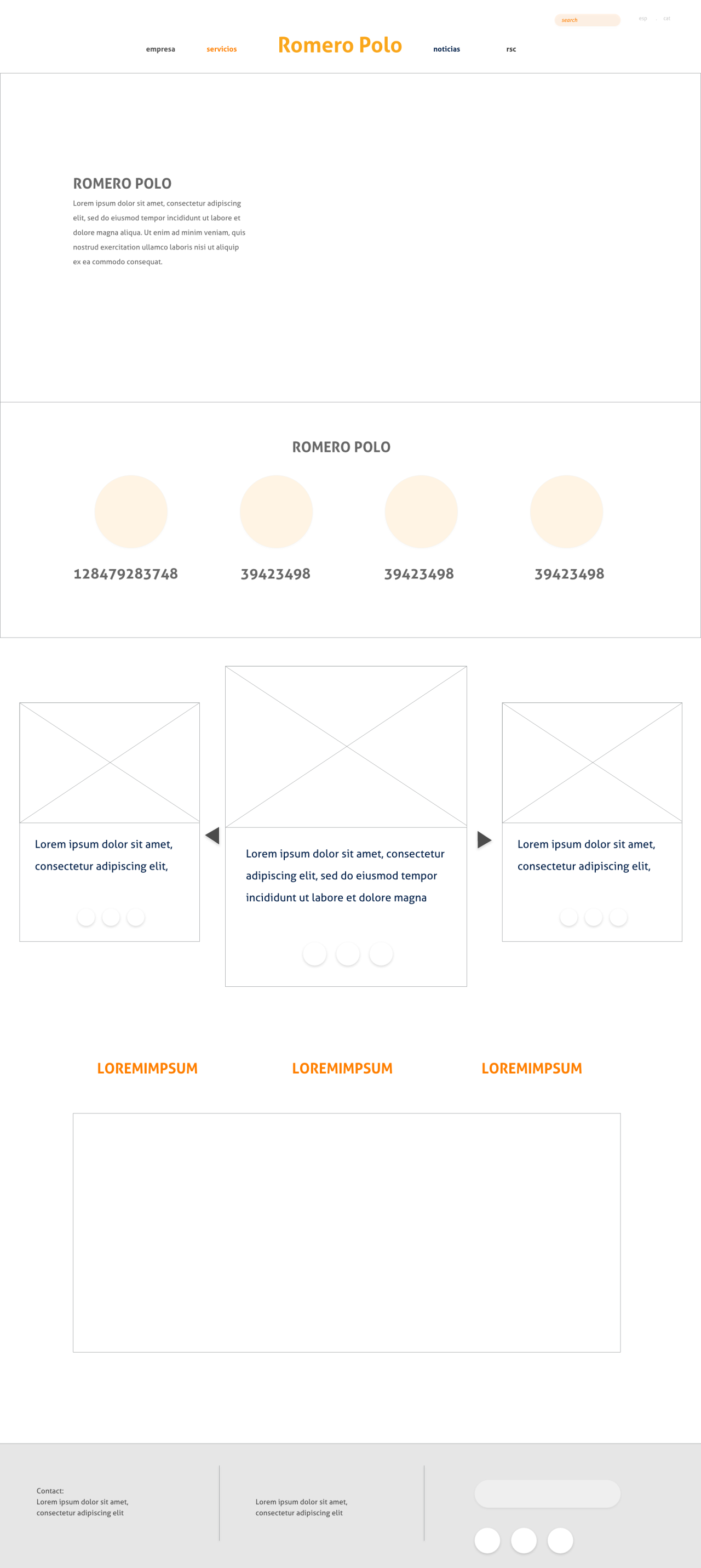


I have prepared the wireframing in order to represent the connections between the different screens and to define how the site will be organized in a practical perspective. Thanks for all the information I have gathered during the previous phase of research and the decisions taken during the hierarchy definition, I have sketched out some of the key screens to present how users will interact with the information the company has decided to display.
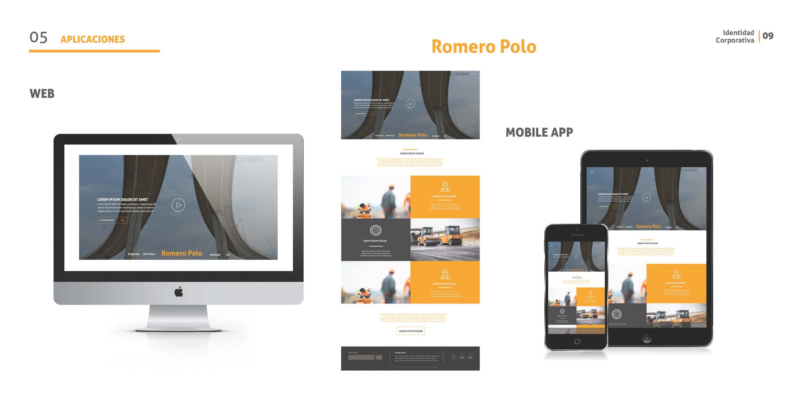
UI: WEBSITE DESIGN
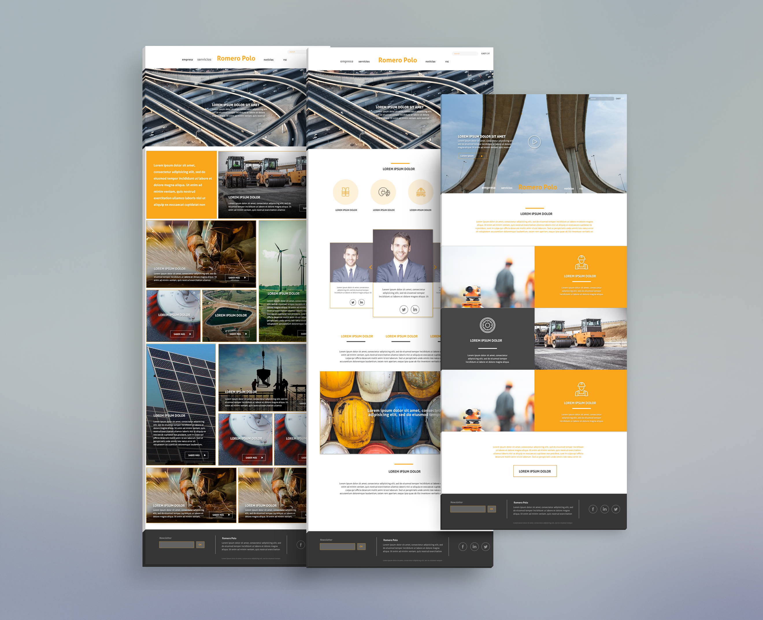
A good knowledge of the company values and their type of customers helped me to think the website UI, to know what needed to be shared and what it should be represented. And also the information the company has an interest to share and that will be useful to the user. A website with a strong impact, where the magnitude of their work constructions can be reflected. We wanted the customer to be amazed while browsing this website that visual. Last but not least we had to include main visual brand elements to reinforce the brand identity of visitors.