A mobile platform of sharing messenger services
that connects messengers with space capacity
and senders with shipping needs. For the messenger,
it’s a good way to reduce his travelling costs. For the sender,
it’s an alternative way of sending things.
The idea of ONWAY come from our experiences in HONG KONG,
During which we had to deprive some products because of its high cost of shipping from Spain. ONWAY is based on collaboration and optimization of resources, which generates a positive social impact.
ONWAY
Business Model · UX/UI · Branding · Digital Marketing
INTRODUCTION
USER RESEARCH
2014 100.000 daily flights · 2015 68,1 million of tourist in Spain · + 1.200 millions of cars worldwide · 2012 578 million of passengers used railway transportation in Spain · 27,2 million of cars in Spain · 2015 Spanish airports traffic was 207.5 million of passengers.
PERSONAS

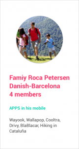

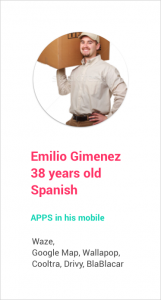
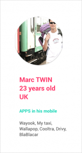
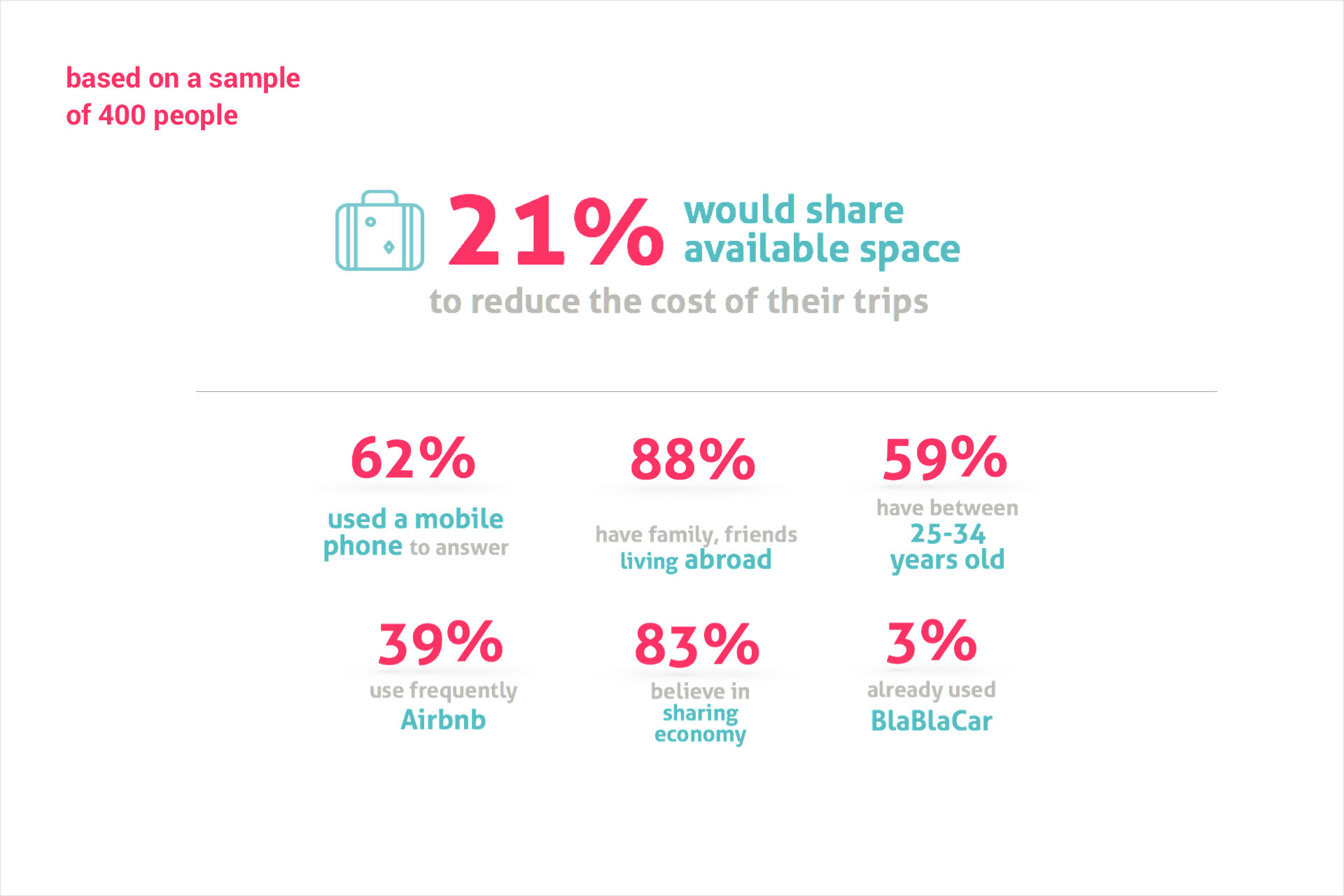
With the Design Thinking process and after interviewing to various potential users, we find out some characteristics of our target. Our personas are mainly foreigners and money conscious.
Life abroad make them early adopters of all theses applications that make their daily life easier in their new living country.
UX: USER FLOW
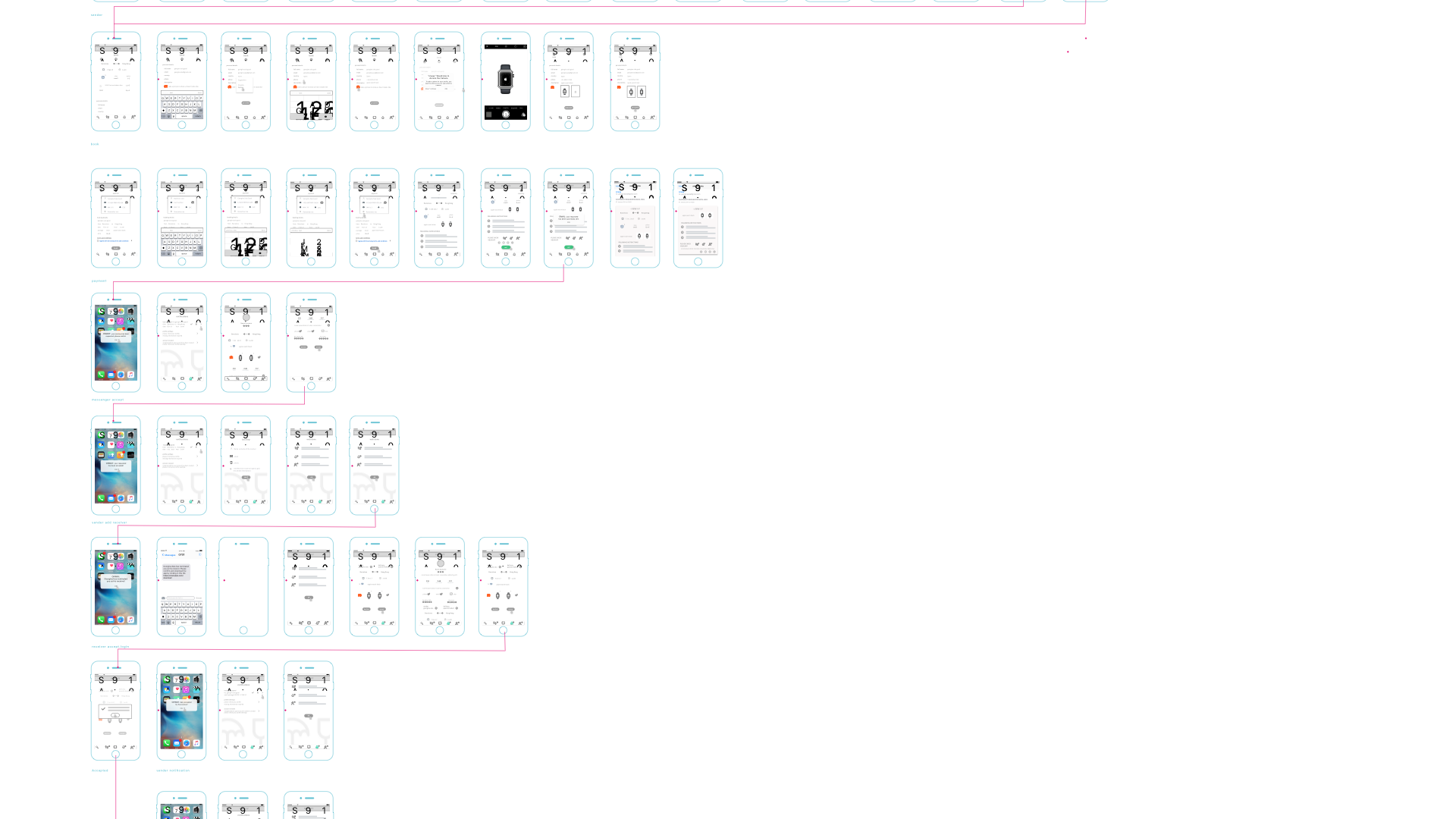
This user flow detail the complete sum of experiences that the customer goes through when interacting with the App. It documents the full experience of being a user of the app whether you are a sender of a messenger. It gives an overview of the entire experience and identify key interactions users have with the App.
STYLE GUIDES

ONWAY, comes from On The Way has been chosen for its clear and easy understanding. In a second, the idea of the project can be understood. A fresh, young and dynamic branding, matching precisely with the values of its main users: Foreigners who moved abroad for a better economic situation. The brand values of the company established at the beginning of the project are dynamism, kindness and natural.
UX: Wireframes
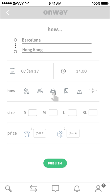
Once the user flow was finished, I could prepare the prototype phase. During this phase I have detailed all the important and needed screen of the project.
I wanted to present the project and submit it to some tests, for these tests we stayed at a structural level.
Thanks to these wireframes I have ensured that the page content and the functionalities were positioned correctly based on users and the business needs.
UX: APP FLOW
Following the navigation of the user allowed us to find out the pain points of the mobile app. It also helped to reduce the number of steps of the process or even calculate the time it takes to complete a search.
Ui: APP

Colorful and full of energy, simple and clean screens are the hymn of this new company. ONWAY positionate themselves as a disruptive model and every single element must follow.
UI: InTERACTION
Since the beginning of the project we have insisted as much as possible on the user friendliness with intuitive, clear icons and easy steps to follow.
The sharing economy is facing challenges, the successful adoption will only be possible with a good product interaction.


