Mi Tres Torres

Website · Social Media 

INTRODUCTION

Mi Tres Torres is becoming the reference clinic in Barcelona. When you get to a hospital with a medical condition or illness, you tend to be frightened and distressed. Your loved ones feel this way too. In Mi Tres Torres, they are determined to do everything in their hands so that patients can recover their most precious asset, their health, putting at their disposal all of their resources, both technological but especially human. This is their commitment. For this, they work day by day, trying to improve. They are a large, experienced and multidisciplinary team that, in addition to their knowledge and talent, add something relevant: their vocation and effort working 24 hours a day, 365 days a year.
www.mitrestorres.com
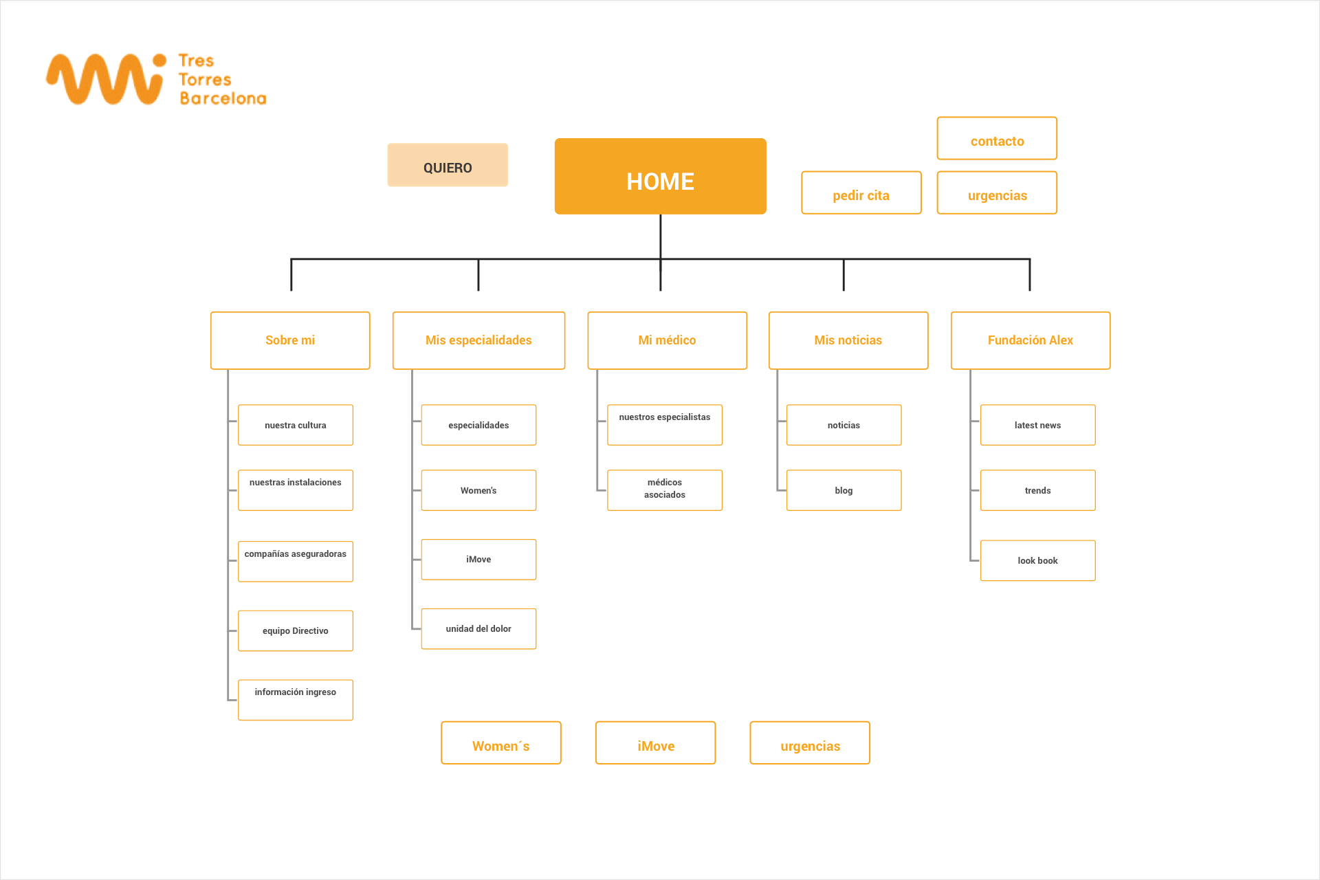
UX: INFORMATION ARQUItECTURE
In addition of being a corporate presentation, the website had to be useful for patients in multiple ways. They had to be able to find information on the clinic services and general health. Generic: Men and women, members of the mutual associate to the centre from 18 years old. Each part is dedicated to its specific target: Women (Adult women of any age), Trauma (generic patient and athletes), Oncology (adults and childrens of the third age), Pain treatment (generic).
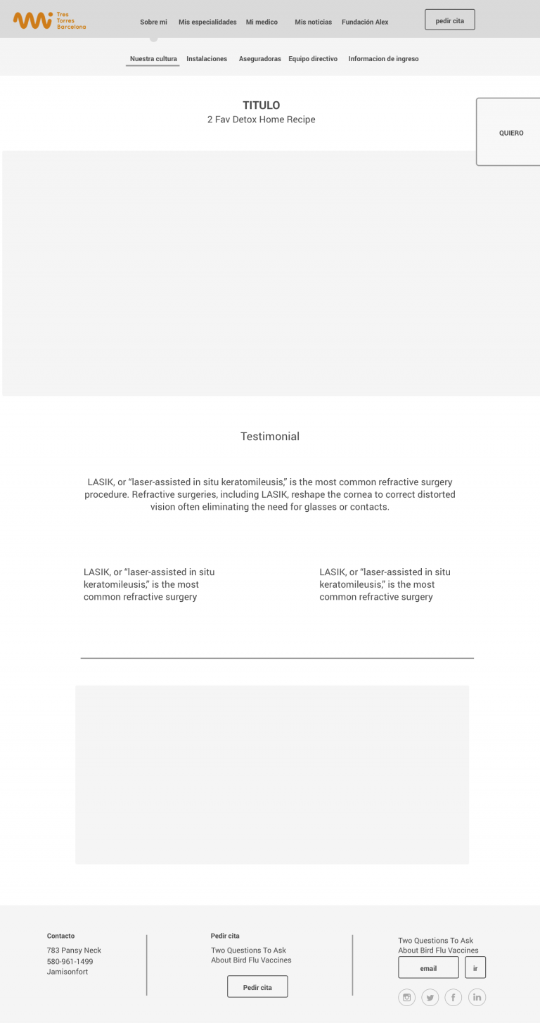
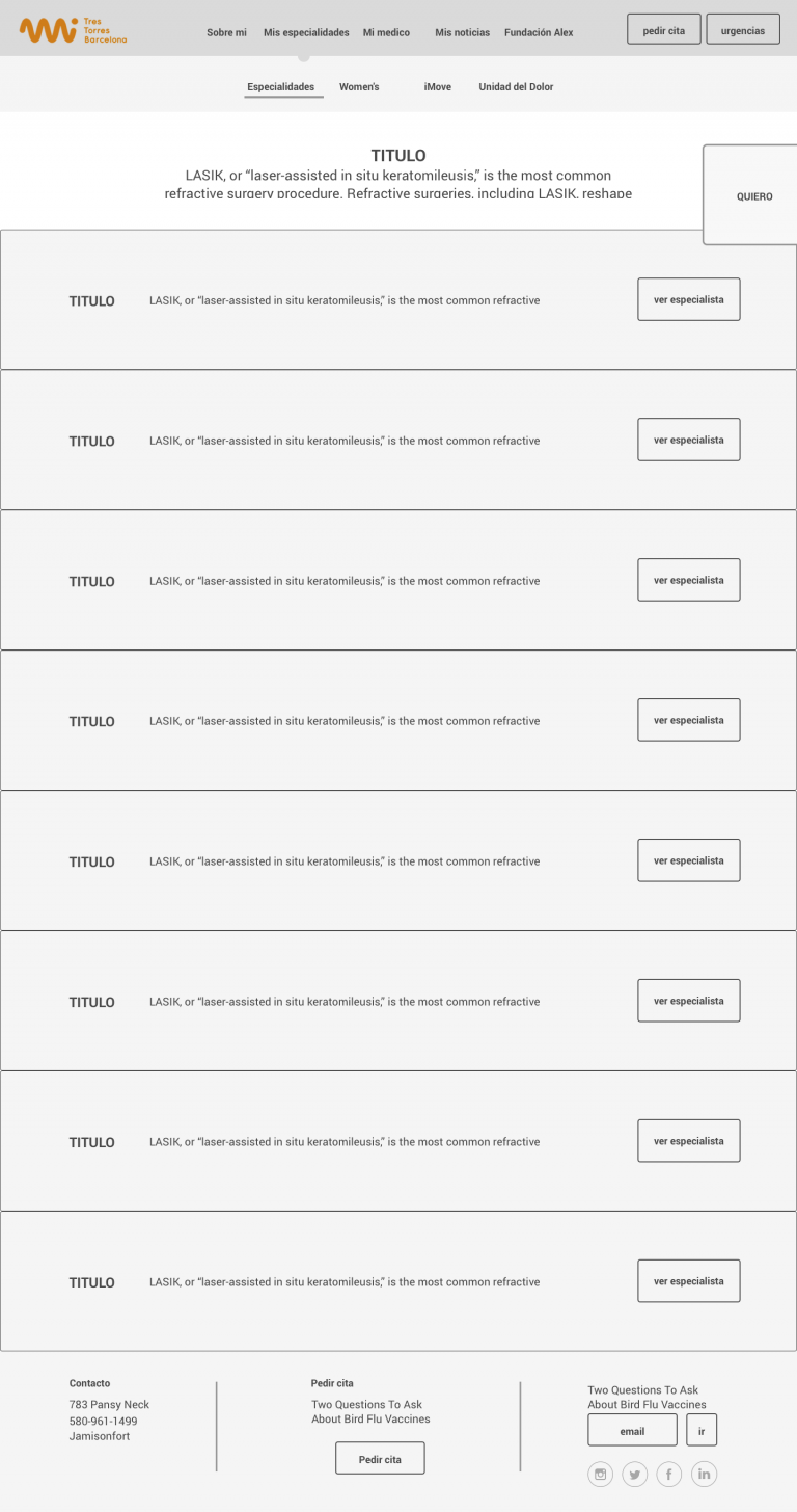
UX: Wireframes
This website had to be valid for both new and current customers. The use of a large number of images creates a nice atmosphere; the patient is surounded with healing, care services and health professionals. Call for an appointment is always visible on the right side of the screen to give a sensation of immediate availability. The website is designed as a showcase of the clinic' s full range of teams and services.
UI: website design
At the visual/code stage the focus is on polishing and no longer on drafting or experimenting. The backbone of the wireframe is pretty much intact, although some visual tweaks are still possible. The principal message to share is: A reference Clinic boutique in Barcelona. Medical specialisation with a focus on 4 areas. An outstanding service. Needs aware with personalised services. The website had to be very simple to use, visual and useful to the patient, who needs to find the information easily. The use of good graphics and images that give a feel for sensibility, patients' emotions, closeness and exclusivity is important.