LUXTNT

Brand · UX/UI 

INTRODUCTION

LUXTNT.com is a disruptive online platform aiming to become Asia’s premier online luxury fashion rental service. LuxTNT.com believes everyone should have the opportunity to be an IT girl and plans to equip Asia’s fashionable with all the luxury handbags and accessories they could need for all of life’s special occasions. Through LuxTNT.com, customers can easily borrow for up to 90% off retail prices a high-quality luxury item. Delivery and return of the item are handled via courier in all neighborhoods of Hong Kong. All their products are 100% authentic and mainly bought from the U.S. and Europe.
www.luxtnt.com
Visual Brand Identity
LUXTNT stands for Luxury tonight. Dedicated to the asian market, LUXTNT gives everyone the possibility to own a luxury bag for a day or a special event. This identity is giving us the true values we want to share: Sobriety and elegance.
Background
The logo even thought most of the time will be placed in a dark background, it might be possible that it is used in a white background. By default the logo in a black background is the norm.
Usage
The LuxTNT brand always need to apear alone, respecting the clear space already defined in the brand guidelines. On supports such as the business cards it is requiered to always use the vertical orientation.
Typography
The house of Didot in Paris, France was one of the most illustrious in the annals of typography. This is Didot, a seriff that from its begining comes from the hand of royalty. I have chosen this typography for the symbol it represents. The font Didot gives text a classic and elegant feel. For other types of communication an other typography more modern but still elegant in order to express together with Didot the brand values. The target was to reinvent luxury products therefore the use of two complementary tipography was a success.
Color Palette
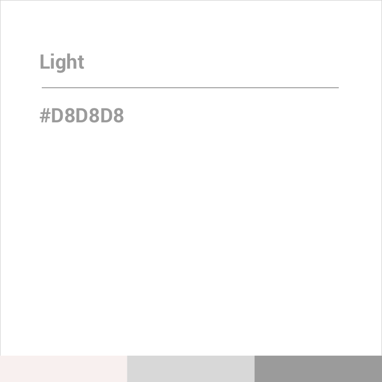
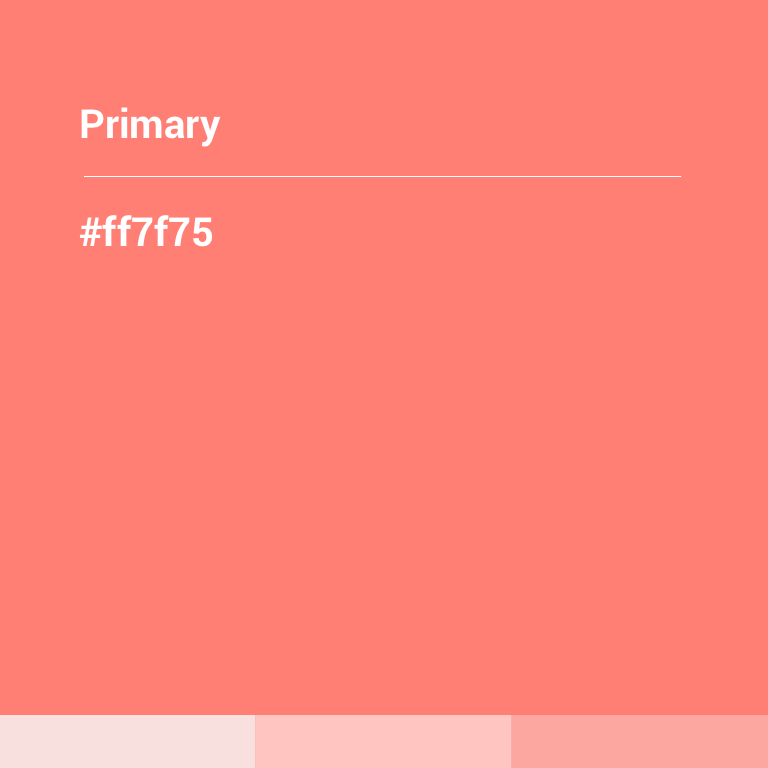
Playing with the binome luxury/modernity the predominant black color together with the white and some touch of salmon we have manged to positionate the brand with its values.
Mood AND Tone
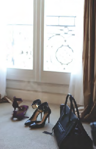
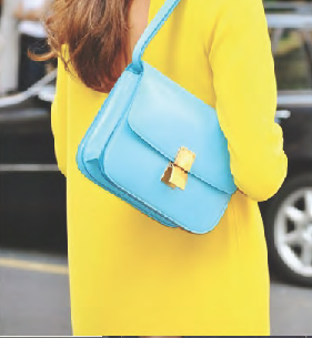
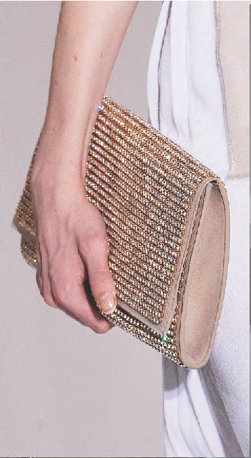
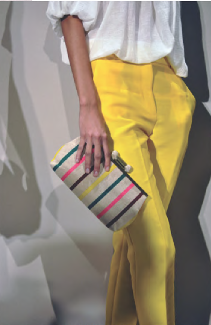
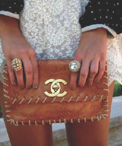
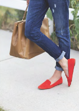
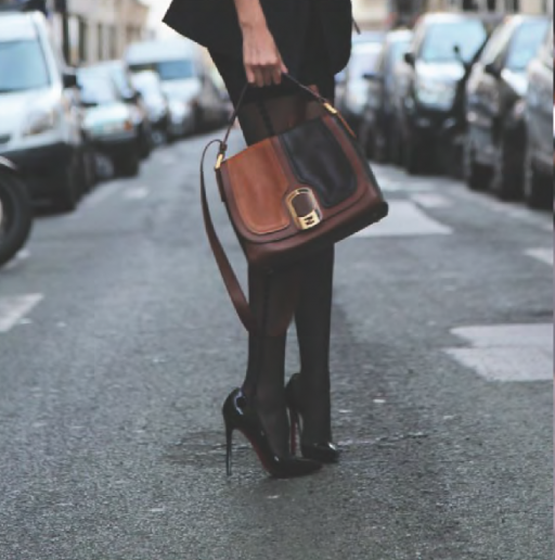
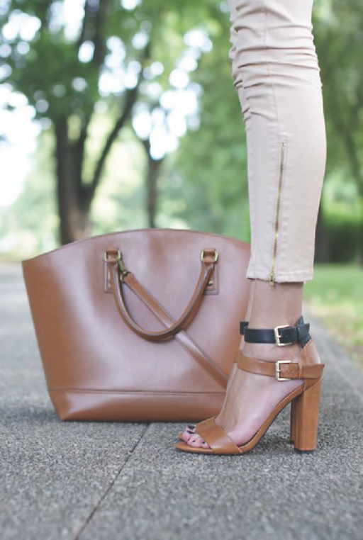
 Fresh, elegant, modern, stylish are the types of values we associate with these pictures. LuxTNT is adressing to a young target that are changing the way they consume luxury compare to their parents. 
UX: INFORMATION ARQUITECTURE
In a great exercise of condensing and at the same time communicating the novel concept of luxury, we try to create a fantastic experience from the first steps of the product creation. This experience was to turn LuxTNT not only into a website for renting bags but also to your personal stylist. This is the reason why sections like designer, events, etc were created. I was not only focused on the information organization, but also in the result of its activity.
UX: WIREFRAMES
The wireframe I have created was a great representation of a custom eCommerce. I have created the wireframe in order to structure and laying out all the website information. On the top of all stand the brand design, it is an exceptionally important attribute in the world of web design, and especially in the fashion industry. I used the grid layout for an easier readability and scannability. The white spaces helped me to build visual hierarchy between elements. In addtion, the typography has been carefully chosen to add an interesting and realistic compromise.
UI: website design
The look and feel had to be sexy, we had to tease users thanks to visuals carefully selected. Bags and products had also to be aestetic as one of the main challenge was to create trust with consumers, they could be reassured that bags were no copycat. Luxury at a competitive price, unbelievable but true.